Wednesday, 29 December 2010
Bea de Giacomo:
Lovely publications and imagery from the photographer, a very good source of inspiration for my static project!
Tuesday, 28 December 2010
Love for Leeds:
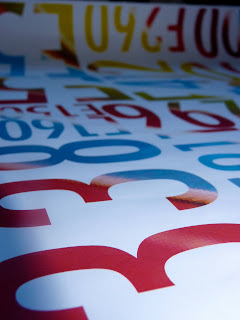
Leeds based studio Design Project commissioned this rather lovely book in conjunction with the Henry Moore Foundation. The book entitled 'Privacy', is a collaboration between Berlin photographer Olai Nicolai and European artists' collective Protoacademy. It deals with the idea of people becoming more insular and protective of themselves, yet at the same time, the general public being increasingly obsessed with celebrity culture the the invasion of their private lives. I like the deeply saturated photographs in the book, along with the circular halftone fluoro pages.
Monday, 13 December 2010
Sunday, 21 November 2010
Audree Lapierre:
Audree Lapierre specialises in packaging design, data visualisation and surface design. I found this data visualisation diagram of the different areas of data visualisation, and how certain sub-categories over lap with one another. It couldn't be more appropriate for my on going investigation into data visualisation for my dissertation.
Seven summits infographic: Seven summits of mountains from the seven continents.
I like how there is a nice ratio between image and graph, which is something that is quite difficult to get the right balance of.
Wheel of Nutrition:
Created by designers Hafsteinn Jullusson, Rui Pereira and Joana Pals, plates designed into pie charts that divide the nutritional value of your meal up into sections. To cater for people with 'different needs', there are three available types; Diet, extra ordinary and supersize. The goal of the plates is to reduce obesity by making people stick to the pie chart. I just think its a different approach to infographics, as it is not only making people aware of their health, but then makes suggestions to how they can improve on the state of their diet.
Tuesday, 16 November 2010
Fake food:
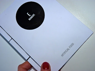
I found this image entitled E Number (The pantone food) by the french illustrator Stephane Massa-Bidal, which may have helped me reach a break through within my project......
His global concept is called 'Retrofuturs', in which he mixes the past, present and future altogether. I like his slight use of infographics, along with illustration.
His global concept is called 'Retrofuturs', in which he mixes the past, present and future altogether. I like his slight use of infographics, along with illustration.
Monday, 15 November 2010
Jerry Uelsmann:
Home is a memory
Surrealist photographer Jerry Uelsmann creates fabrications of reality, which I thought would feed in nicely to the idea of fakery. I found some of his photographs in the book Fabrications: Staged, altered and appropriated photographs. Fabrication being deliberately false or improbable account, these images visually represent this term perfectly.
Little Hamburger Tree
Studio Verse:
Nicholas Carey of Studio Verse designed this annual AGDA poster in 2010. I thought it was slightly appropriate for the Fakery project I am considering doing. I thought the message reiterated the idea that it's not people, themselves that are fake, it's the exterior they choose to show which can be considered as fake, or not the 'real them'. Carey's rationale of his work seemed fitting, 'Graphic design is to a message what stagehands are to a performance'.
Tuesday, 2 November 2010
History Flow:
Created by designers Fernanda B Viegas & Martin Wattenberg, History Flow is a tool for visualising dynamic, evolving documents and the interactions of multiple collaborating authors. Currently, History Flow has been utilised to visualise the evolutionary history of wikipedia. The history flow application charts the evolution of a document as it is edited by many people.
The results are visually stunning, I really like the colours, and layers, almost as if like contour lines from a map.
Saturday, 23 October 2010
LCAD Graphic Design:
Ian Edward, third year Graphic design at Leeds college of art has some really good work on his website. What caught my eye was his interest in data graphics, which is something that interests me, enough to write my dissertation on it! I really like this particular piece of work he did, entitled, Nottingham: An infographic city guide, a printed publication consisting of 100 data visuals, all displaying information on the city of Nottingham, split into ten key topics. Each topic covers a double page spread with additional larger format fold-outs. As presentation is everything, the publication is held in a hard case and accompanied by silk screen posters with a spot varnish finish - nice!
Best college:
Tuesday, 19 October 2010
Saturday, 16 October 2010
Thursday, 14 October 2010
Static locations:
My static project is starting turn in the right direction, after much research into what exactly is static?!
Static is something of which is fixed or stationary, that experiences no growth or change. This got me thinking, are there any places in this world where there tends to be no growth or change within a community? I came to the conclusion that a place would only be static without any inhabitants what so ever, which led me to conducting an investigation into abandoned, or 'static' locations around the world. I have become intrigued with such places, finding whole cities, and islands that were once a metropolis of activity that have been left empty and isolated due to disaster, or socio-economic failure.
Kadykchan, Russia. Built during World War II for coal mining purposes, Kadykchan was once a thriving Russian town, however in 1996, 6 men were killed in an explosion in the coal mine. The mines were shut immediately, with 12000 people being evacuated, leaving Kadykchan empty.
Kowloon Walled city, Hong Kong.
Now demolished, this city began to grow, beoming one of the most densely populated areas in the world, in 1984, there were 50,000 people to 26,000 square metres. The city became a dangerous place to live, as high crime took over.
Static is something of which is fixed or stationary, that experiences no growth or change. This got me thinking, are there any places in this world where there tends to be no growth or change within a community? I came to the conclusion that a place would only be static without any inhabitants what so ever, which led me to conducting an investigation into abandoned, or 'static' locations around the world. I have become intrigued with such places, finding whole cities, and islands that were once a metropolis of activity that have been left empty and isolated due to disaster, or socio-economic failure.
Gunkanjima, Japan.
Hashima Island, or Gunkanjima, meaning Battleship Island is one of 505 islands off the coast from Nagasaki. The island was populated from 1887, to 1974 as a coal mining facility.
San Zhi, Taiwan.
Purposely built as a futuristic holiday resort for the US military in 1980, however the site was never finished and no tourists came to stay due to a series of fatalities whilst constructing the site.
Kadykchan, Russia. Built during World War II for coal mining purposes, Kadykchan was once a thriving Russian town, however in 1996, 6 men were killed in an explosion in the coal mine. The mines were shut immediately, with 12000 people being evacuated, leaving Kadykchan empty.
Kowloon Walled city, Hong Kong.
Now demolished, this city began to grow, beoming one of the most densely populated areas in the world, in 1984, there were 50,000 people to 26,000 square metres. The city became a dangerous place to live, as high crime took over.
Subscribe to:
Comments (Atom)


